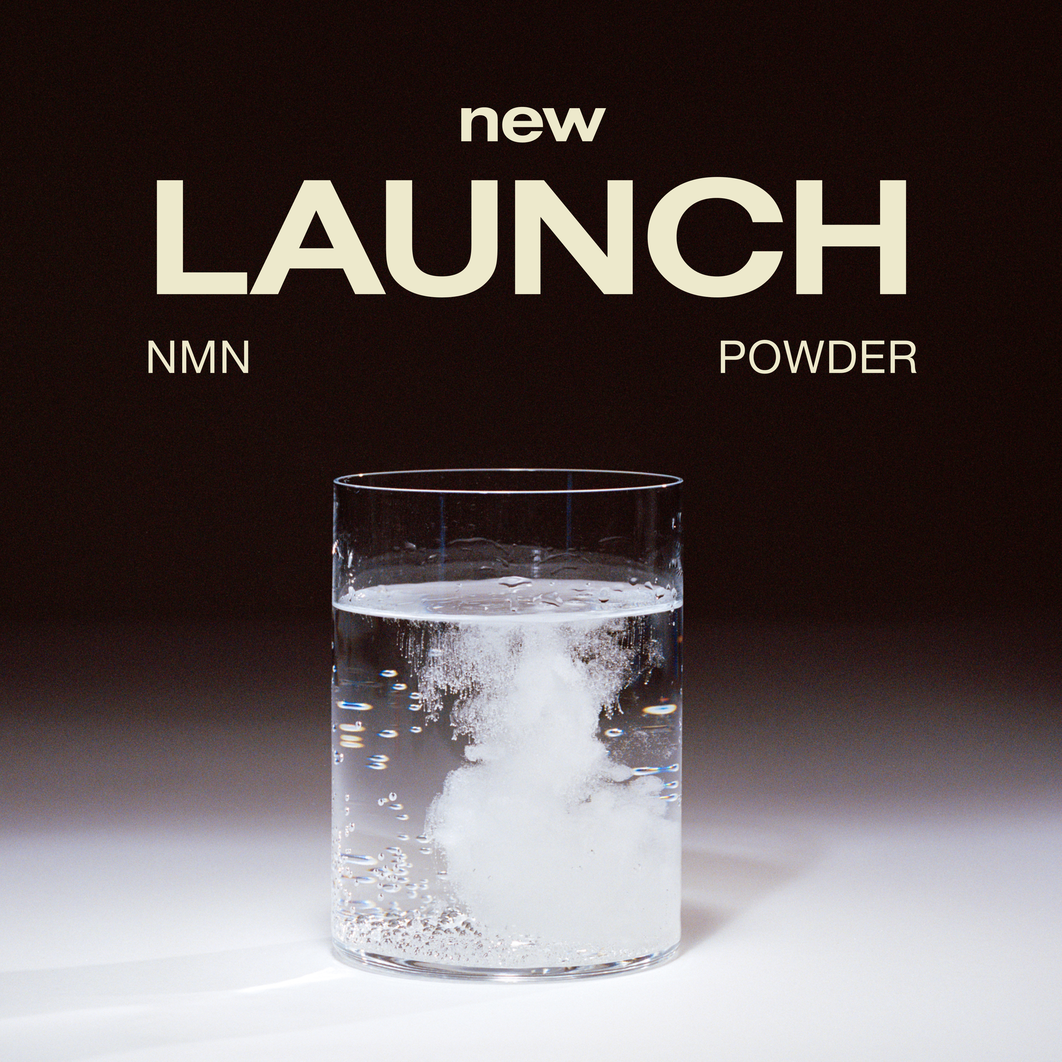
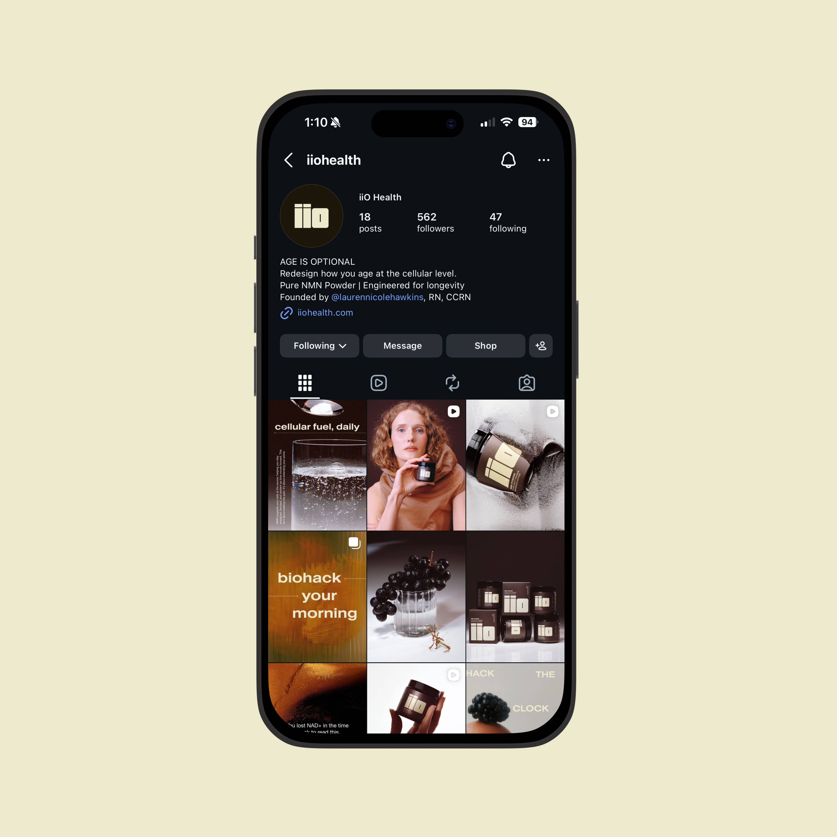
iiO is a modern longevity supplement brand. In a market dominated by clinical, overly wellness-coded identities—and amplified by widespread health misinformation across social platforms—the opportunity was to create something elevated, bold, and distinctly human. Designed to command attention on shelf while remaining relatable and trustworthy, iiO positions itself at the intersection of longevity and lifestyle. The inaugural product, NMN Powder, targets men and women 30+ interested in biohacking and long-term vitality, with a digital-first experience anchored by a QR code that leads directly to the PDP, ensuring transparency, education, and accessibility.
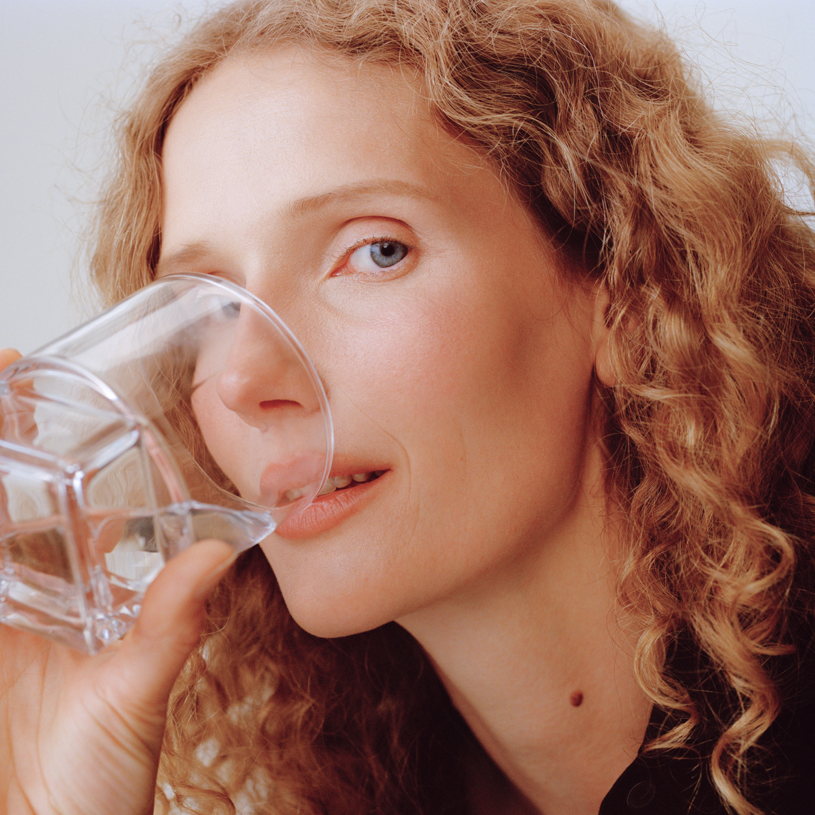
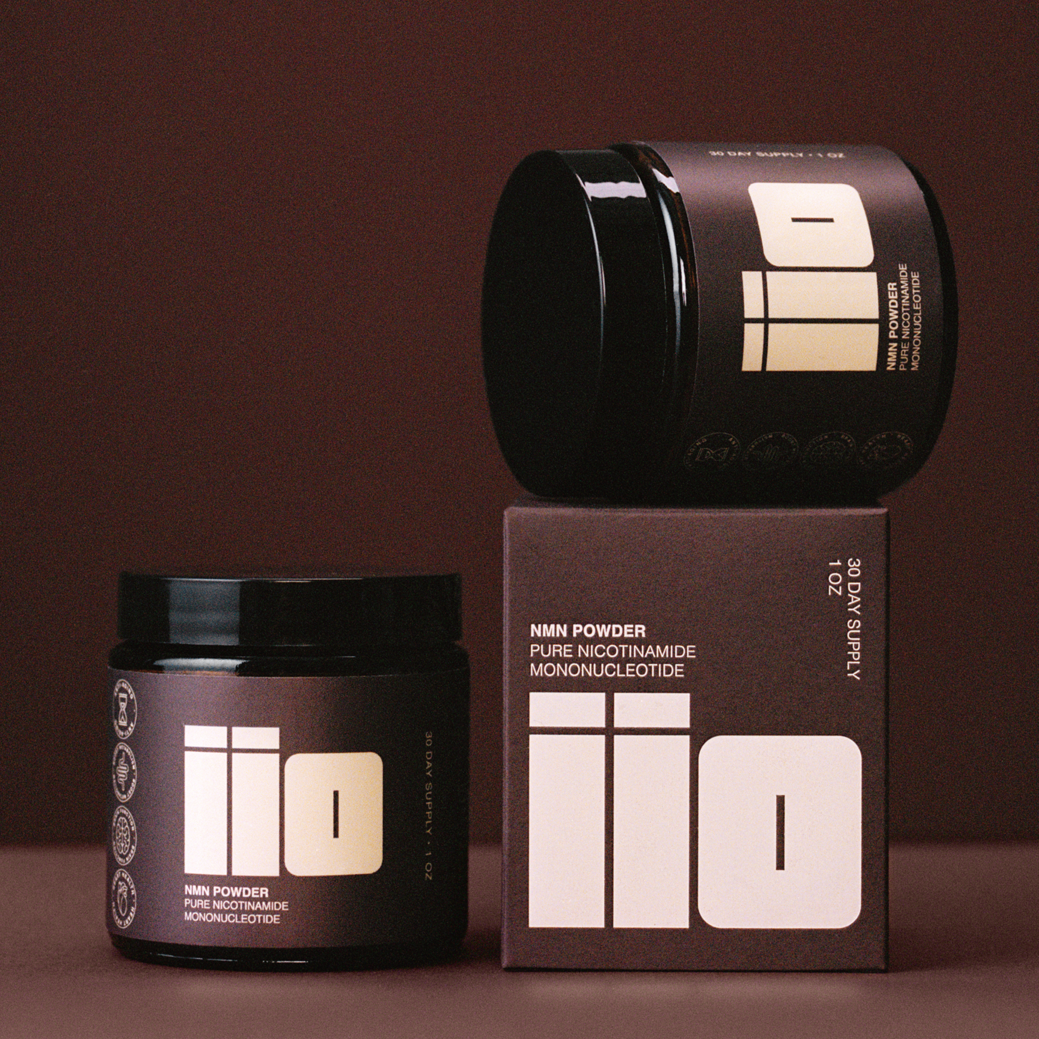
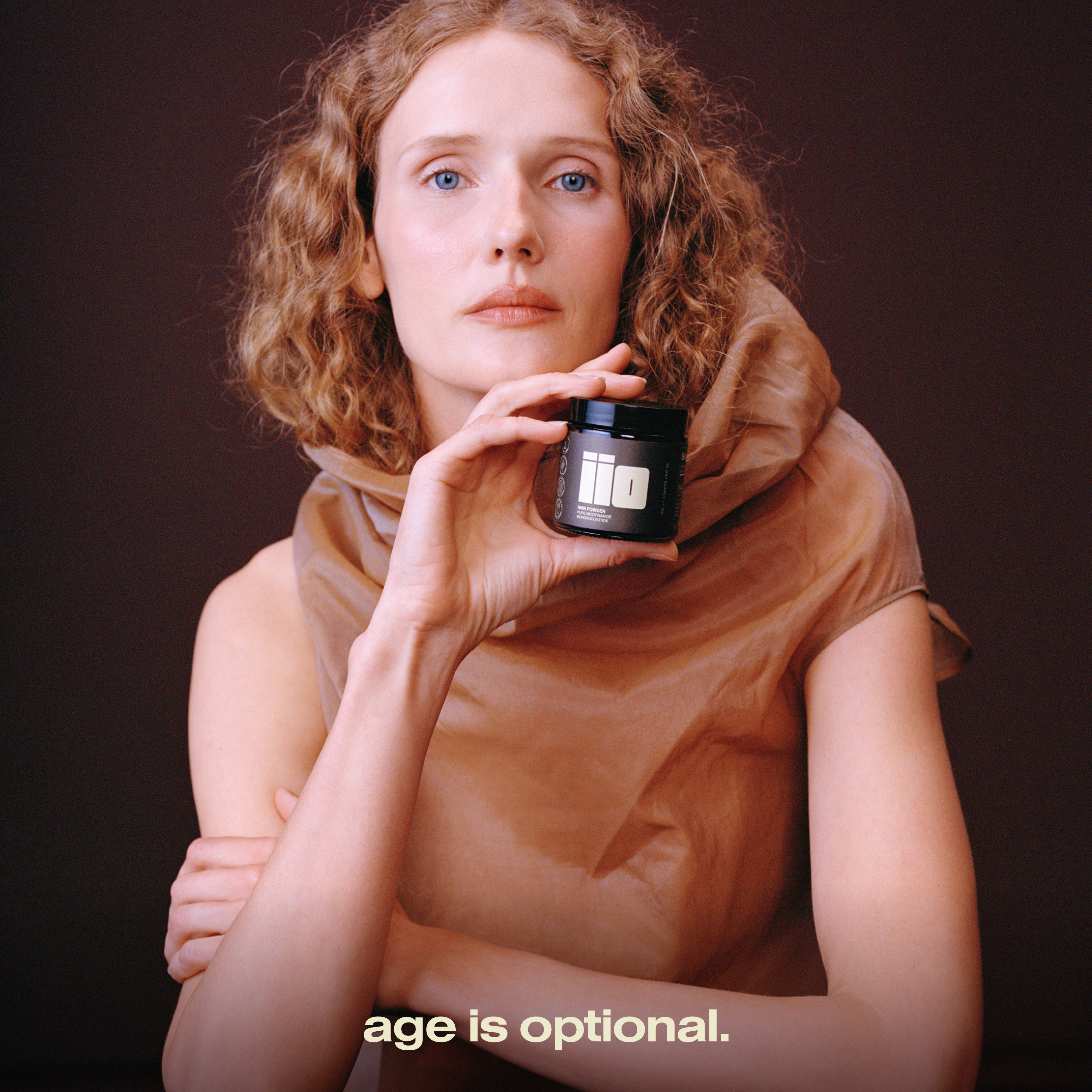
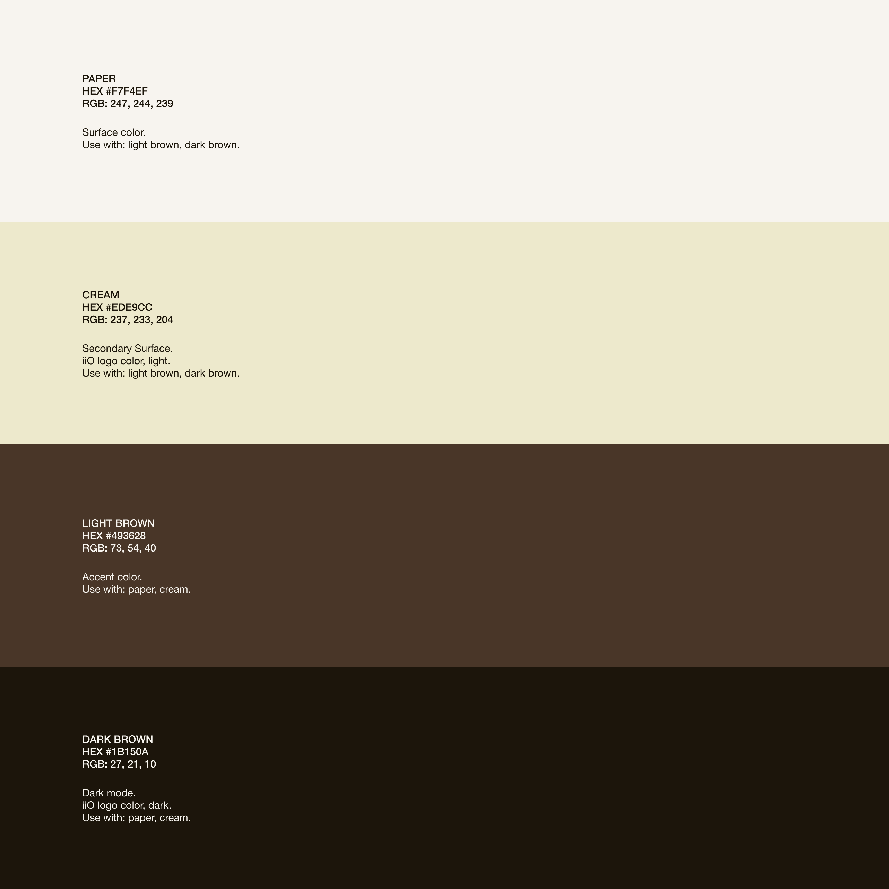
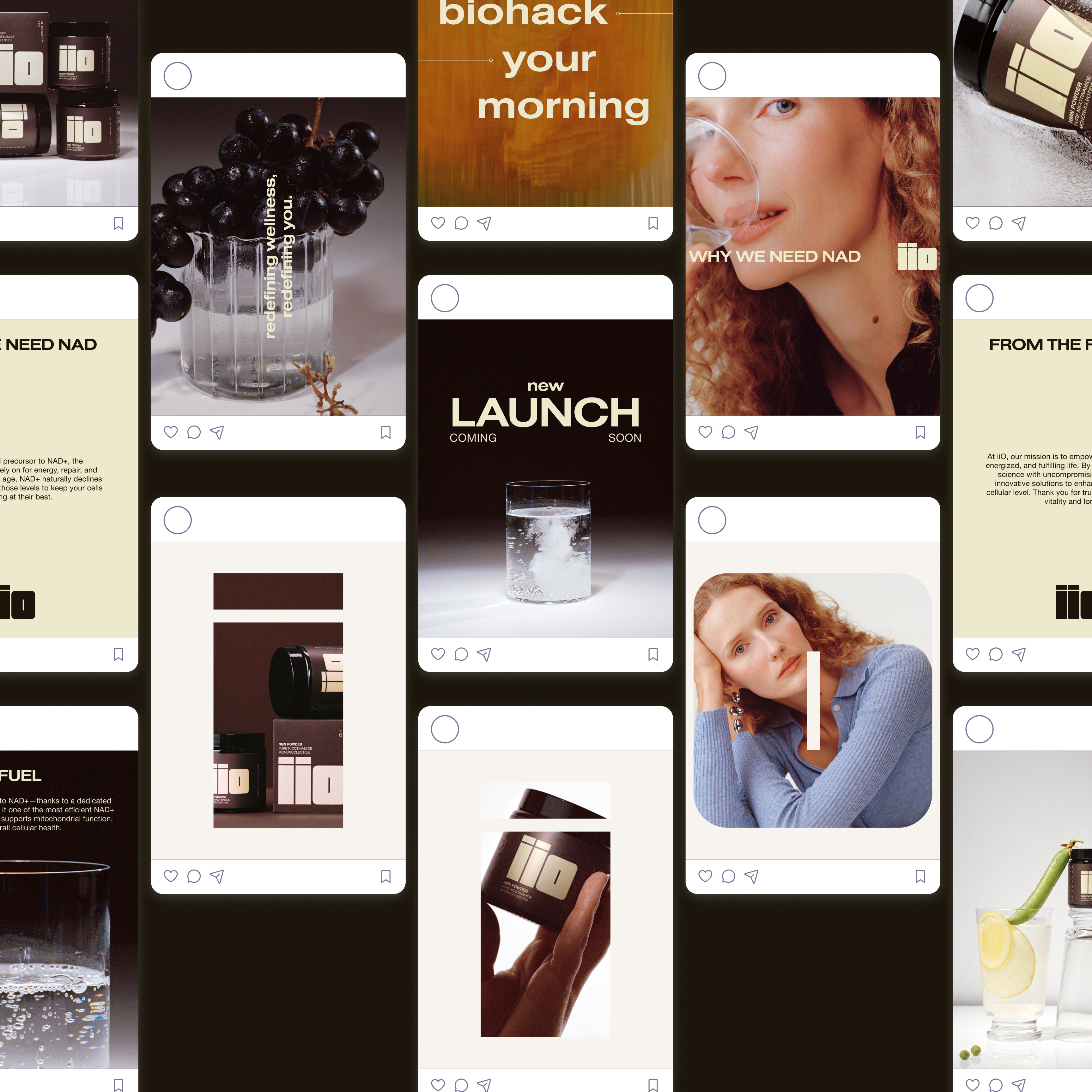
iiO’s visual identity centers on a bold, block-forward wordmark that feels confident and unmistakable. A comprehensive brand system defines typography, color, tone, and application across packaging, digital, and social touchpoints. Packaging and label design were developed in close collaboration with compounding and legal teams to align with regulatory standards while maintaining a strong design point of view. Campaign imagery focuses on clean, hero-driven product moments—highlighting texture, ritual, and instructional clarity. The website experience is designed to feel heroic, refined, and trustworthy, balancing beauty with credibility and reinforcing iiO’s position as a scalable, digitally native supplement brand built to stand out in a crowded market.
iiO HEALTH
2026
SERVICES
Visual Identity
Logo
Packaging
Web Design
Photography
TEAM
Studio Sylvia, Lauren Hawkins
CREDITS
Model & Still Photography: Sylvia Austin
Production: Cherry Studios
Set Design: Astrid Chastka
Videography: Justin Landis

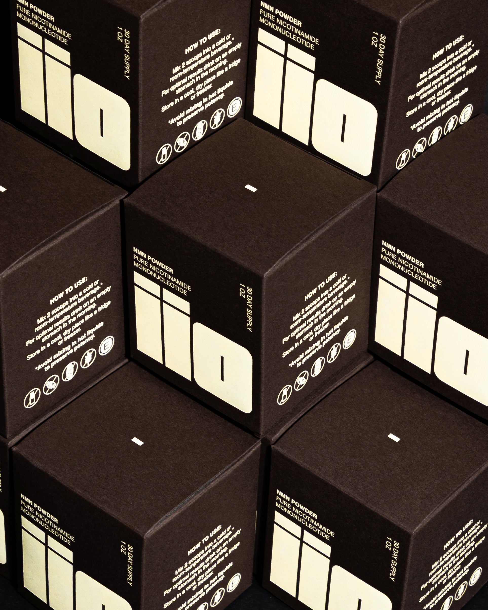
THE LOGO
The iiO logotype is defined by a bold, block-forward structure that conveys strength, clarity, and confidence. Its clean geometry and balanced letterforms create an immediate visual impact, allowing the mark to feel both modern and authoritative within a crowded supplement landscape. The symmetry between the two lowercase “i” forms and the circular “O” introduces a subtle rhythm and cohesion, reinforcing themes of balance and vitality. Designed to be unmistakable at any scale—from packaging to digital—the logotype anchors the brand with a presence that is simple and memorable.

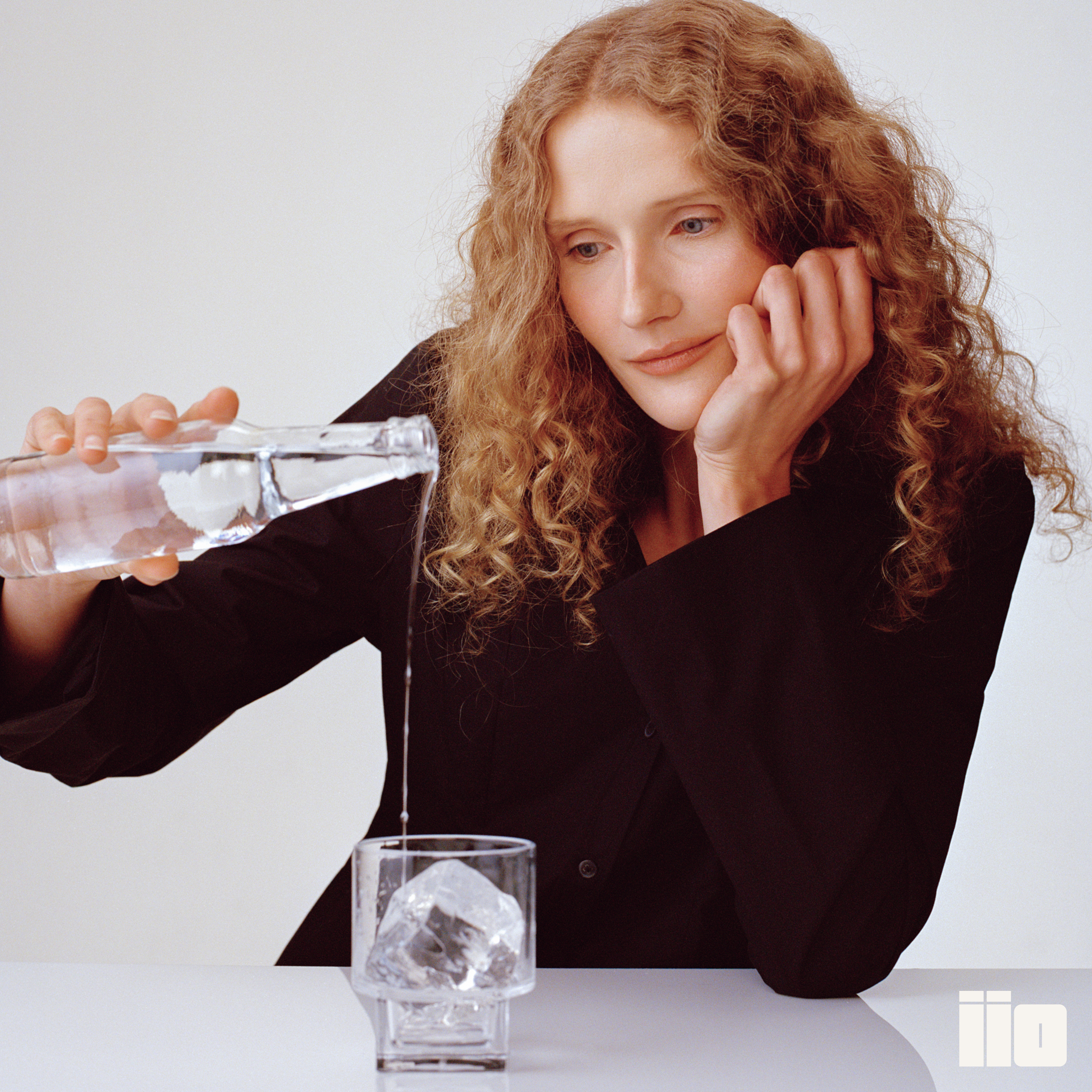
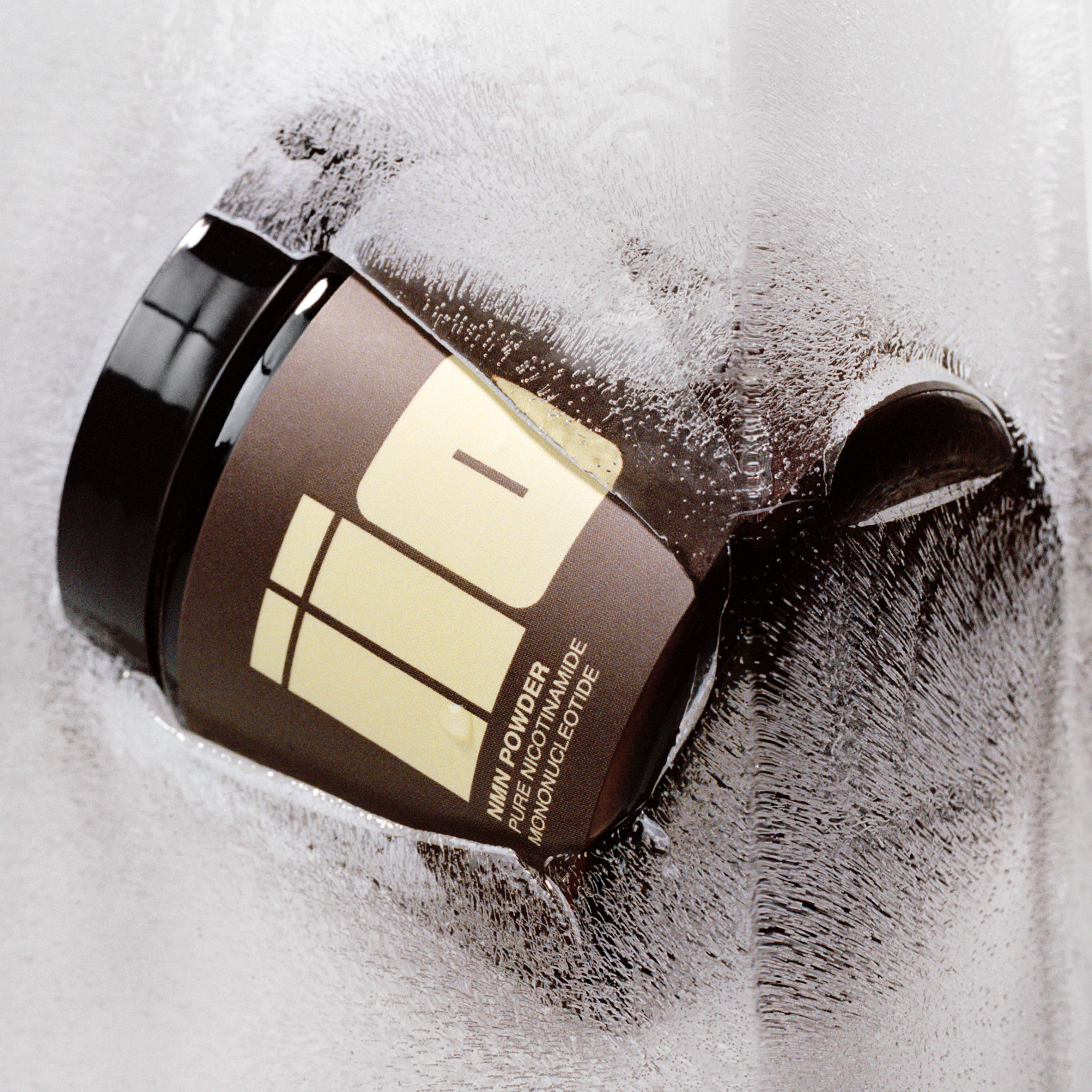
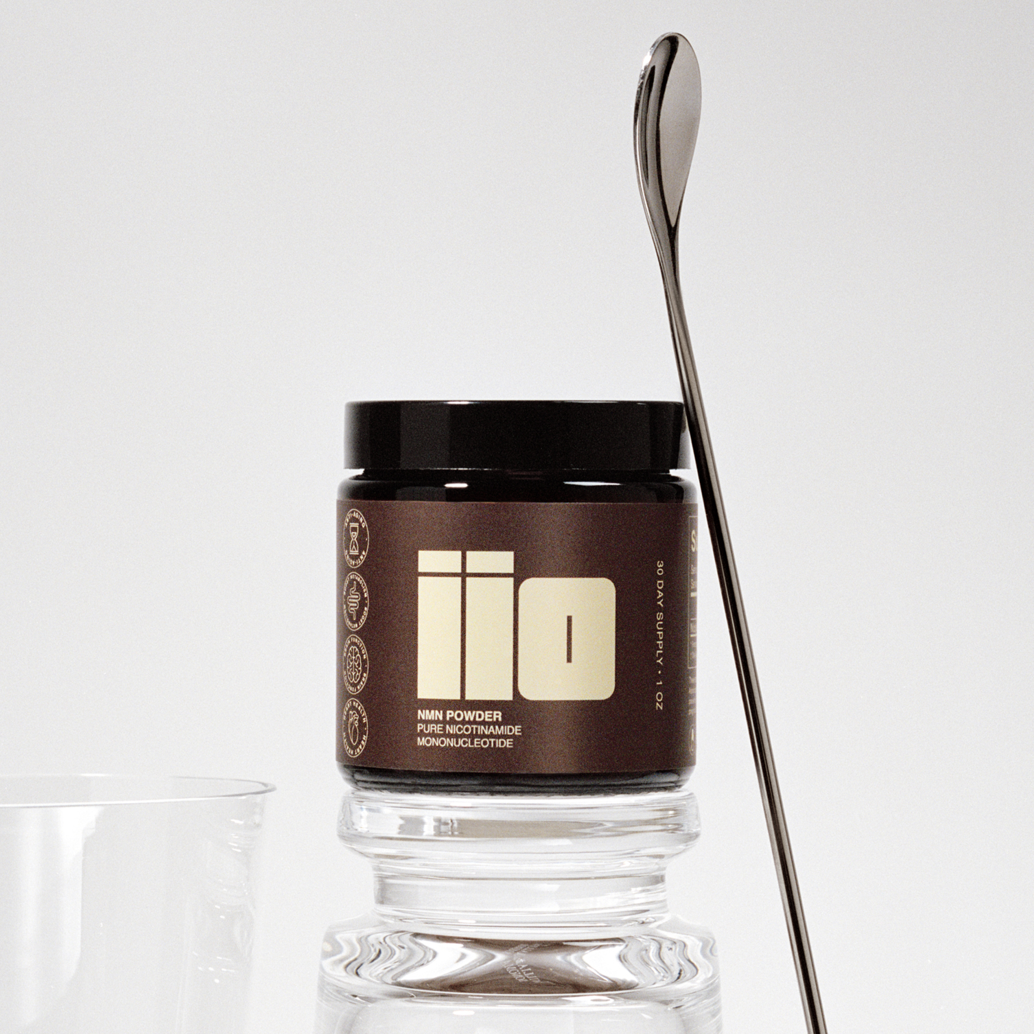
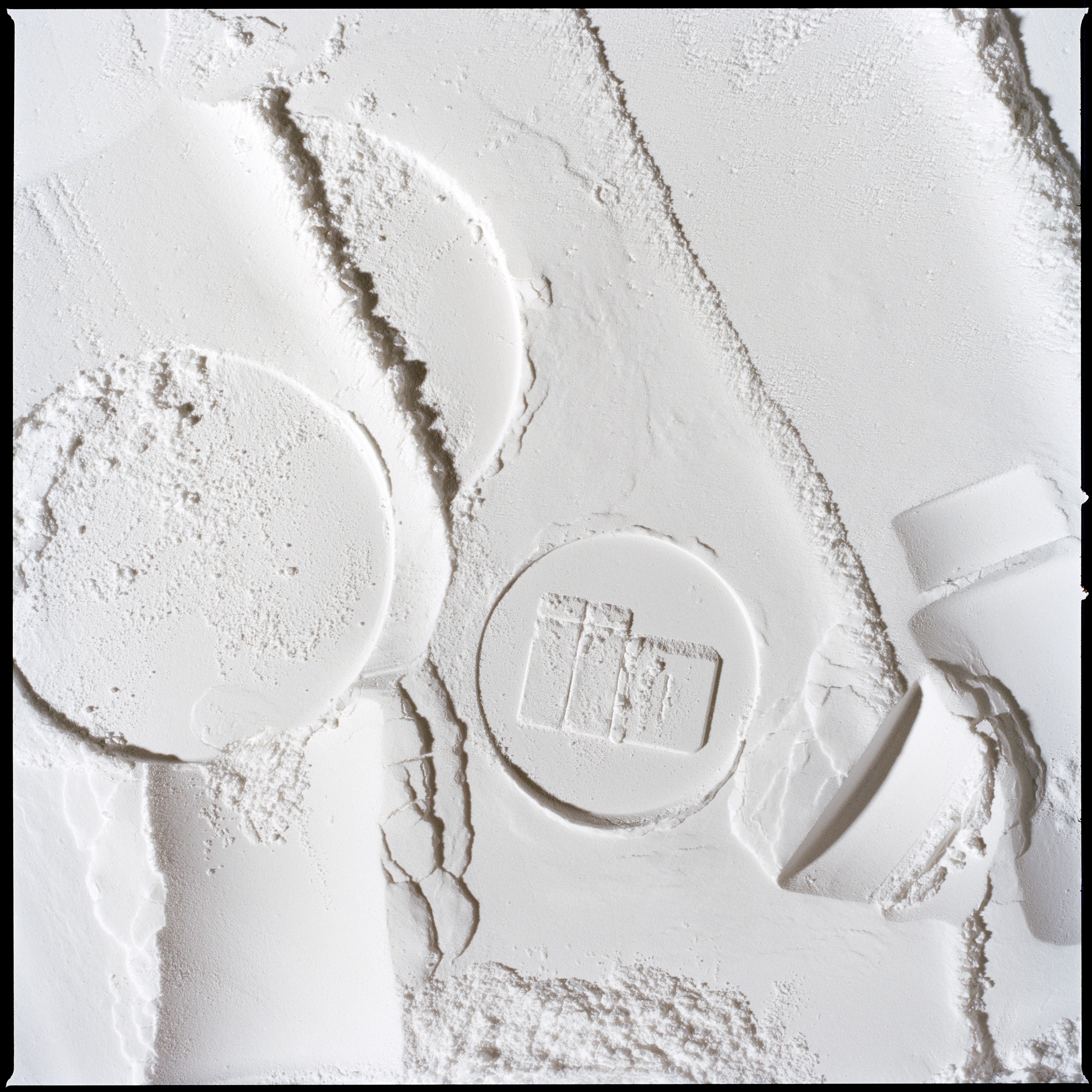
THE VISUAL WORLD
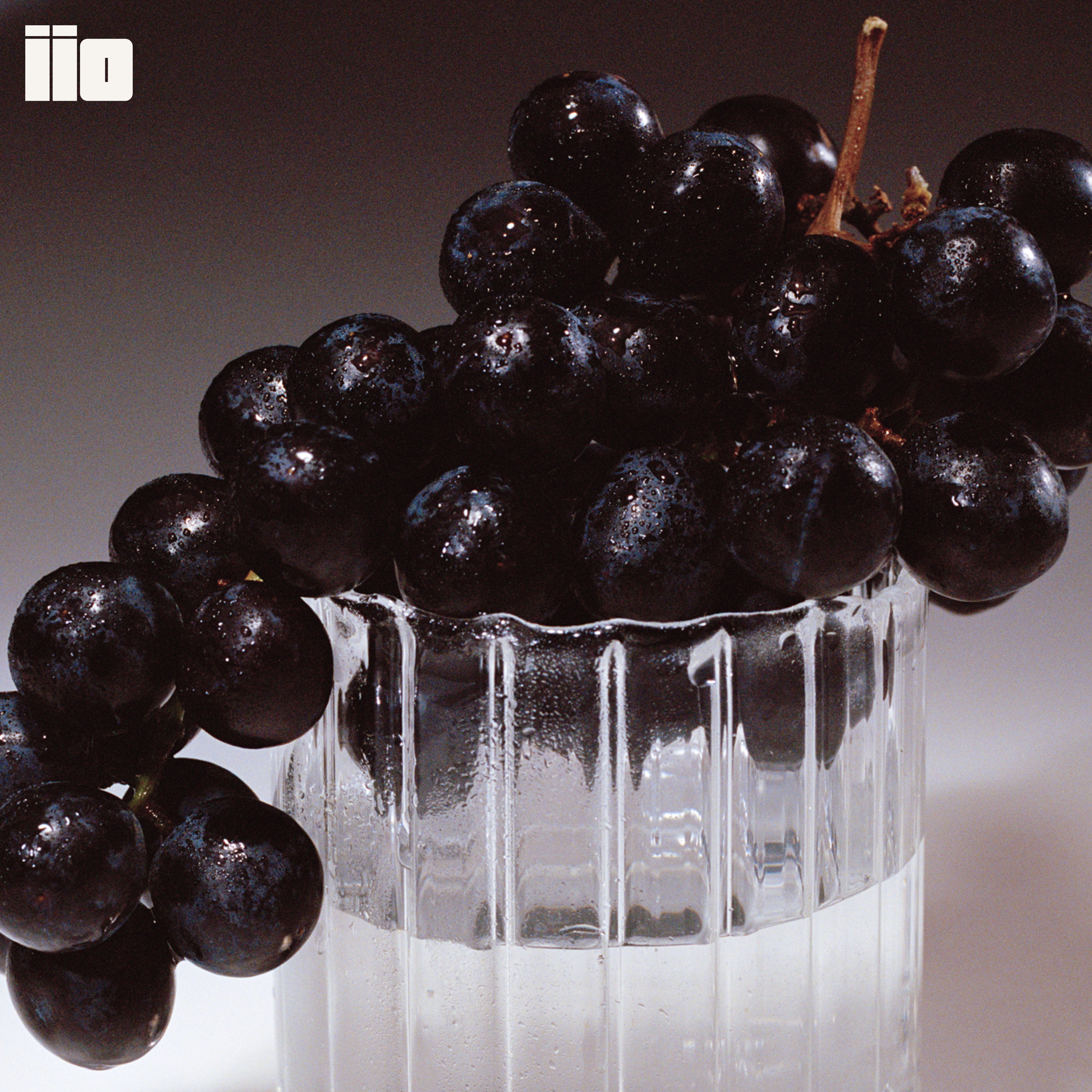
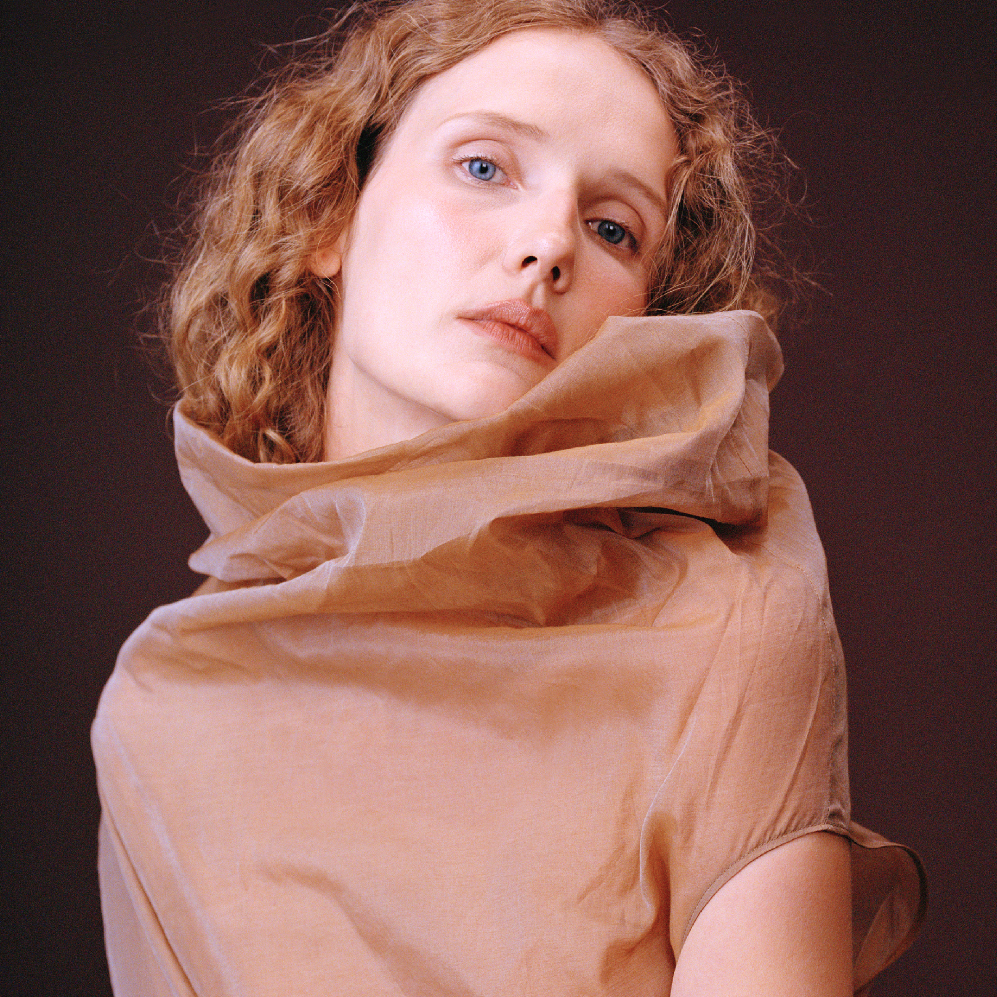
The photography is built around clarity and confidence. The campaign direction focuses on hero-driven product imagery—clean compositions, sharp lighting, and elevated materiality that highlight the texture and purity of the NMN powder. Instructional step visuals are integrated, reinforcing ritual and ease of use. Subtle tonal backdrops and considered props create a modern, minimal environment that allows the bold logotype and product form to lead. The result is a visual language that feels refined, trustworthy, and digitally native—designed to capture attention quickly while reinforcing scientific credibility and everyday usability.

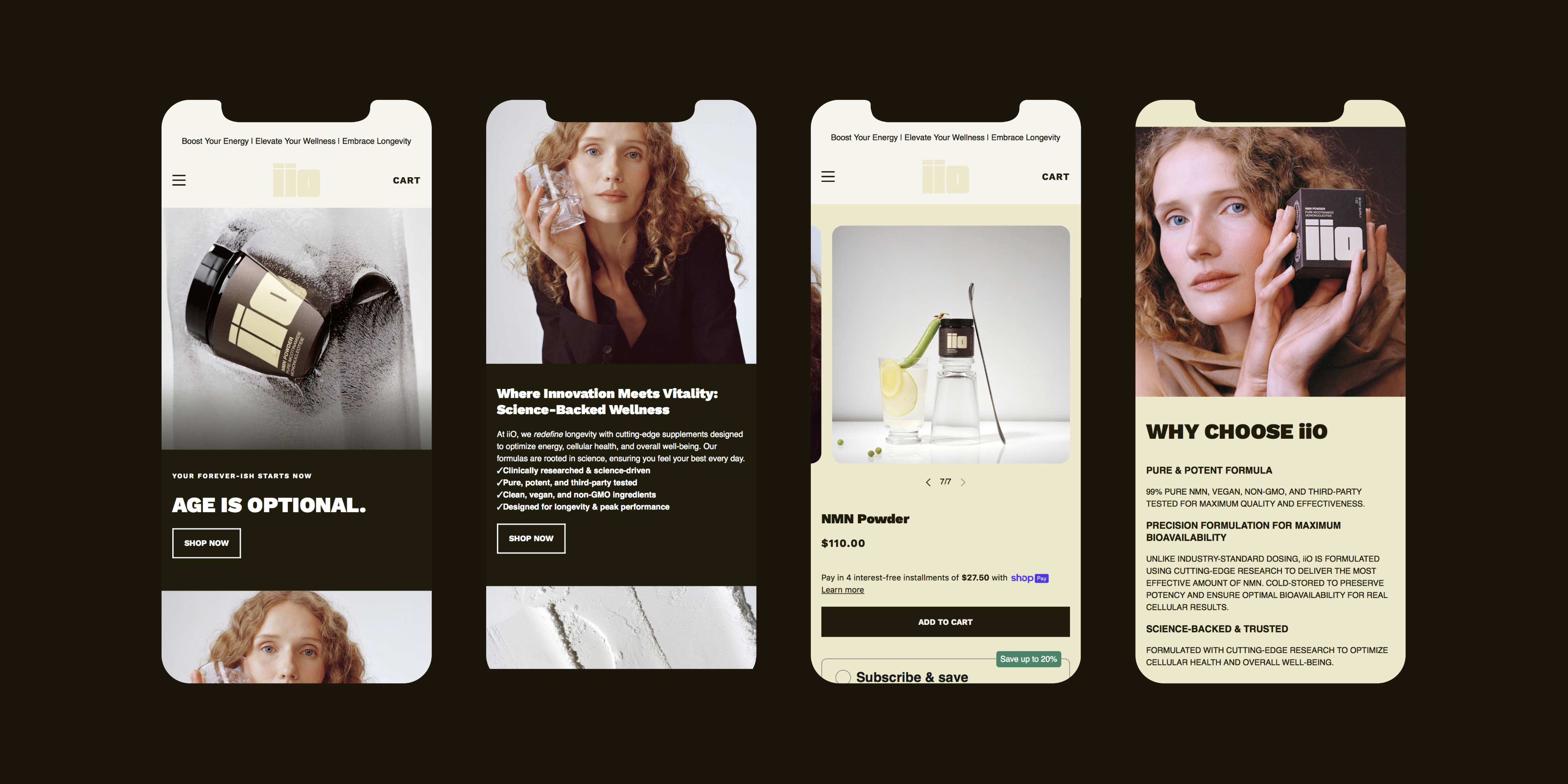
DIGITAL EXPERIENCE
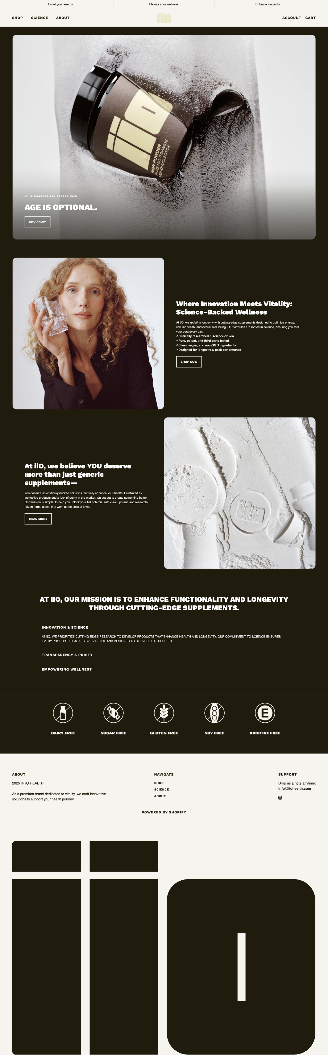
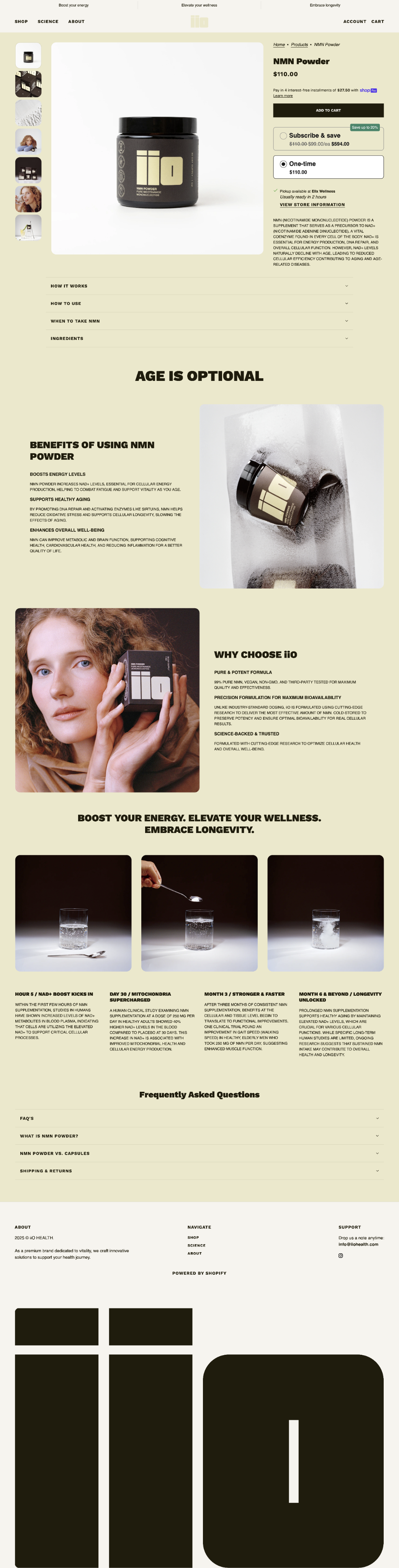
The iiO website is designed to be both elevated and informative: bold, hero-driven imagery establishes a strong first impression, while streamlined product detail pages clearly communicate benefits, usage, and scientific context for consumers purchasing a supplement they may be trying for the first time. The experience balances confidence with clarity—pairing striking visuals and a prominent logotype with accessible education to build trust and support informed decision-making. View website.
OFFICE HOURS
MONDAY–FRIDAY, 10AM–6PM
BROOKLYN, NEW YORK
(EST) / GMT-5
iiO is a modern longevity supplement brand. In a market dominated by clinical, overly wellness-coded identities—and amplified by widespread health misinformation across social platforms—the opportunity was to create something elevated, bold, and distinctly human. Designed to command attention on shelf while remaining relatable and trustworthy, iiO positions itself at the intersection of longevity and lifestyle. The inaugural product, NMN Powder, targets men and women 30+ interested in biohacking and long-term vitality, with a digital-first experience anchored by a QR code that leads directly to the PDP, ensuring transparency, education, and accessibility.
iiO’s visual identity centers on a bold, block-forward wordmark that feels confident and unmistakable. A comprehensive brand system defines typography, color, tone, and application across packaging, digital, and social touchpoints. Packaging and label design were developed in close collaboration with compounding and legal teams to align with regulatory standards while maintaining a strong design point of view. Campaign imagery focuses on clean, hero-driven product moments—highlighting texture, ritual, and instructional clarity. The website experience is designed to feel heroic, refined, and trustworthy, balancing beauty with credibility and reinforcing iiO’s position as a scalable, digitally native supplement brand built to stand out in a crowded market.
iiO HEALTH
2026
SERVICES
Visual Identity
Logo
Packaging
Web Design
Photography
TEAM
Studio Sylvia, Lauren Hawkins
CREDITS
Model & Still Photography: Sylvia Austin
Production: Cherry Studios
Set Design: Astrid Chastka
Videography: Justin Landis

THE LOGO
The iiO logotype is defined by a bold, block-forward structure that conveys strength, clarity, and confidence. Its clean geometry and balanced letterforms create an immediate visual impact, allowing the mark to feel both modern and authoritative within a crowded supplement landscape. The symmetry between the two lowercase “i” forms and the circular “O” introduces a subtle rhythm and cohesion, reinforcing themes of balance and vitality. Designed to be unmistakable at any scale—from packaging to digital—the logotype anchors the brand with a presence that is simple and memorable.

THE VISUAL WORLD
The photography is built around clarity and confidence. The campaign direction focuses on hero-driven product imagery—clean compositions, sharp lighting, and elevated materiality that highlight the texture and purity of the NMN powder. Instructional step visuals are integrated, reinforcing ritual and ease of use. Subtle tonal backdrops and considered props create a modern, minimal environment that allows the bold logotype and product form to lead. The result is a visual language that feels refined, trustworthy, and digitally native—designed to capture attention quickly while reinforcing scientific credibility and everyday usability.
DIGITAL EXPERIENCE
The iiO website is designed to be both elevated and informative: bold, hero-driven imagery establishes a strong first impression, while streamlined product detail pages clearly communicate benefits, usage, and scientific context for consumers purchasing a supplement they may be trying for the first time. The experience balances confidence with clarity—pairing striking visuals and a prominent logotype with accessible education to build trust and support informed decision-making. View website.
OFFICE HOURS
MONDAY–FRIDAY, 10AM–6PM
BROOKLYN, NEW YORK
(EST) / GMT-5