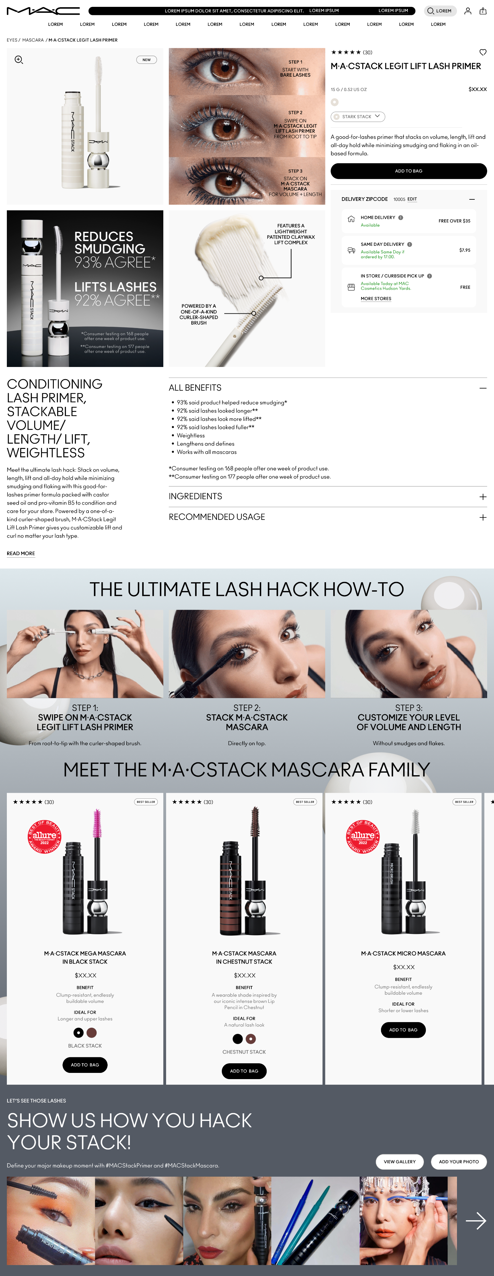
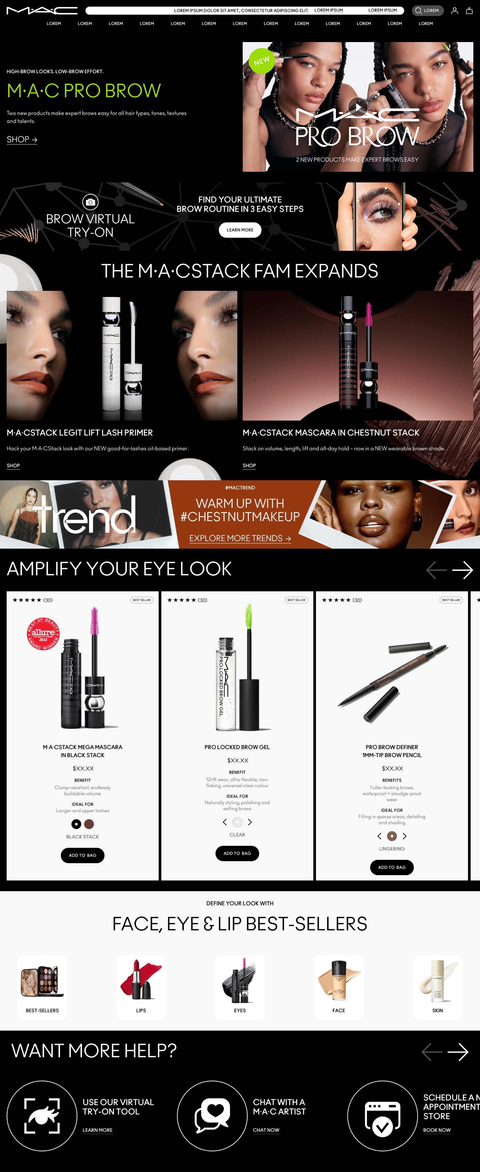
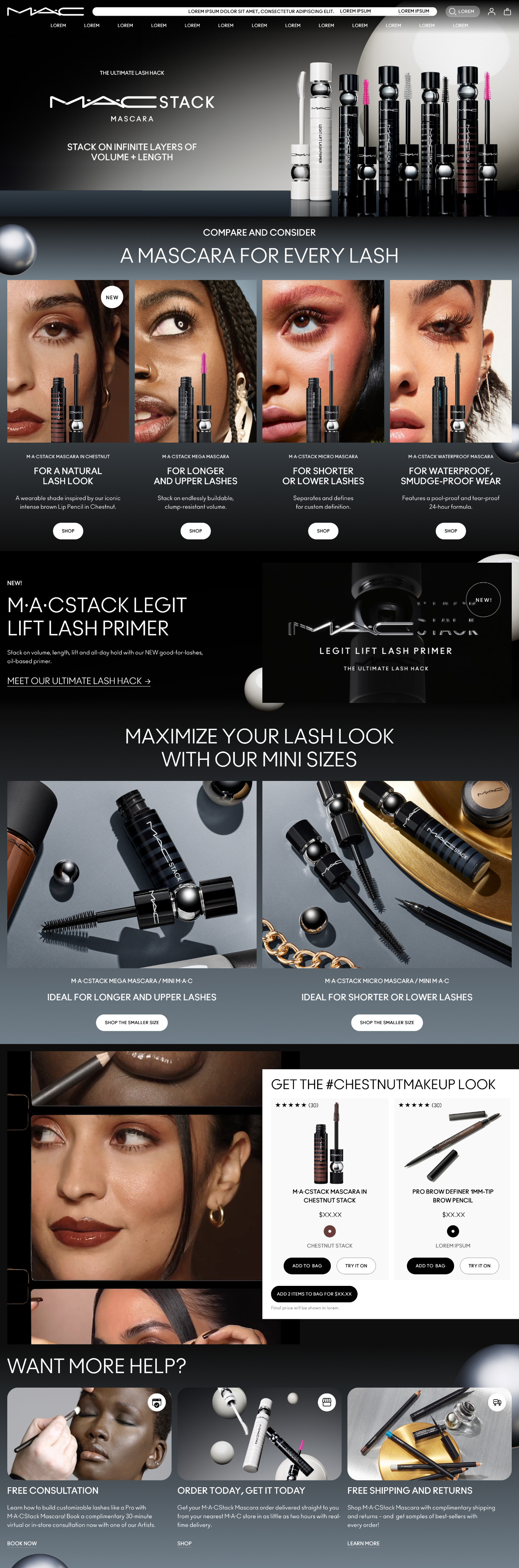
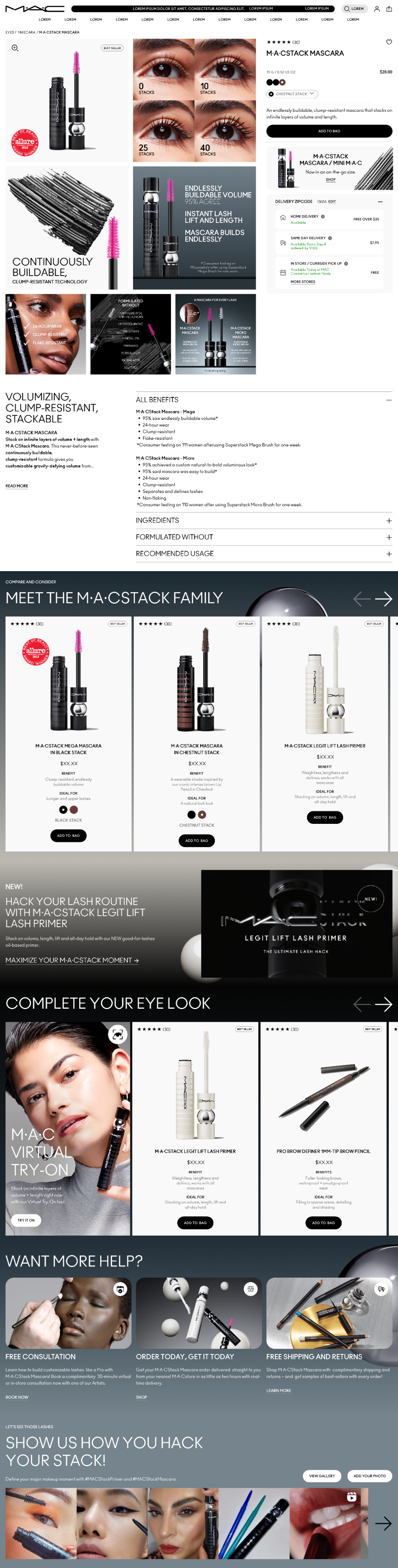
MAC Cosmetics introduced MACStack Primer alongside an their new color, Chestnut, offering as part of a digital-first product launch designed to capture attention across owned channels and reinforce MAC’s position as a leader in artistry-driven beauty. The campaign required a cohesive digital ecosystem that could translate product innovation into an immersive and visually compelling consumer experience.
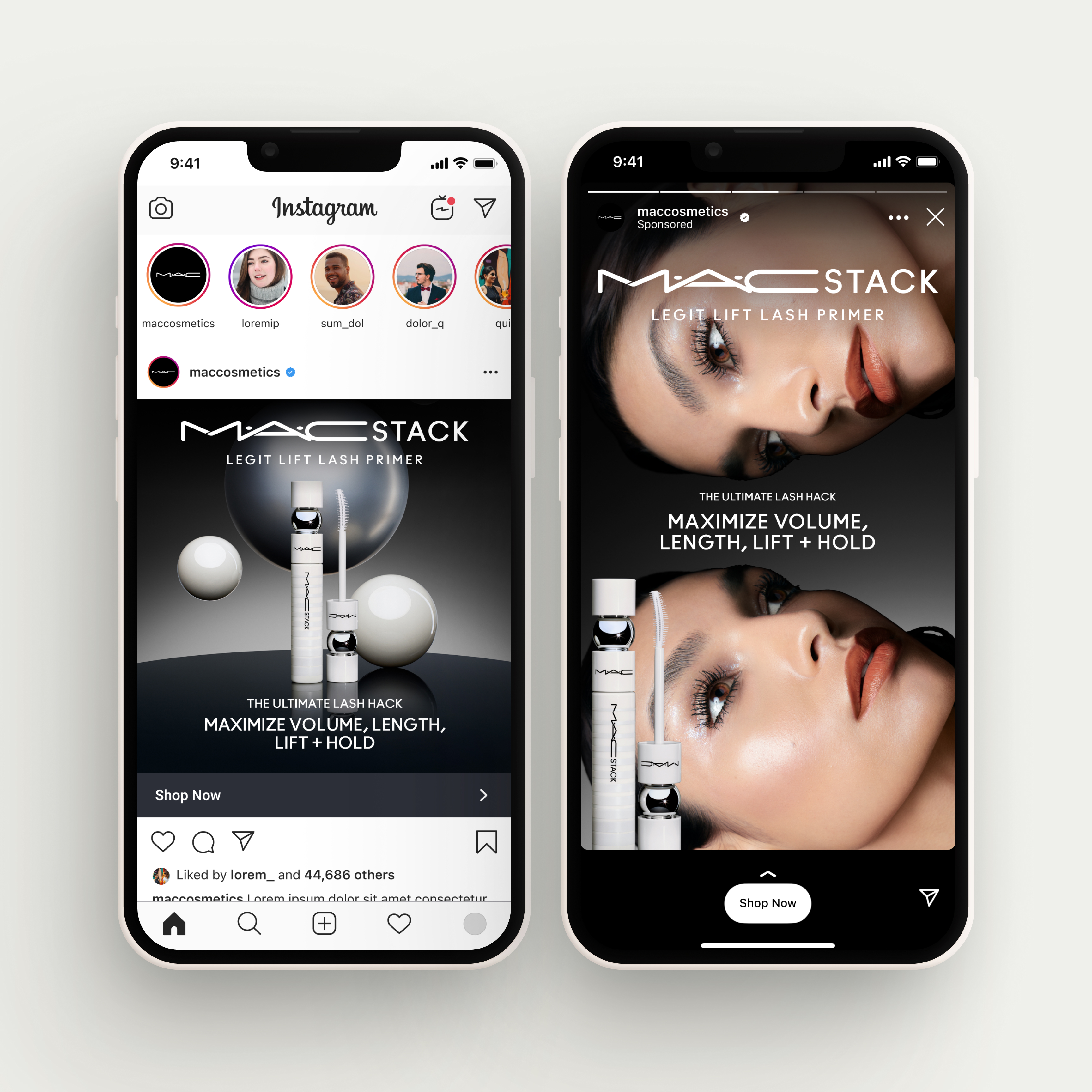
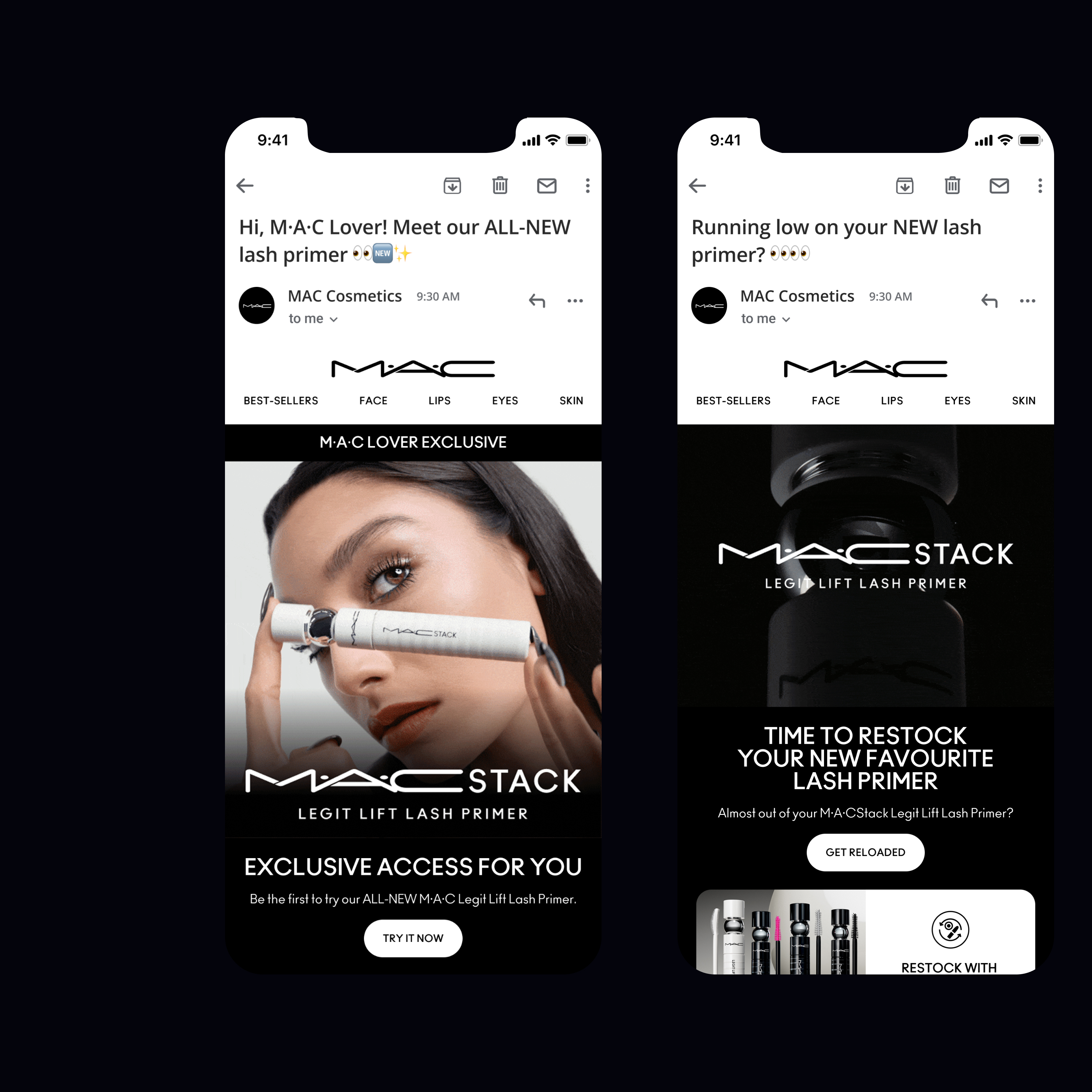
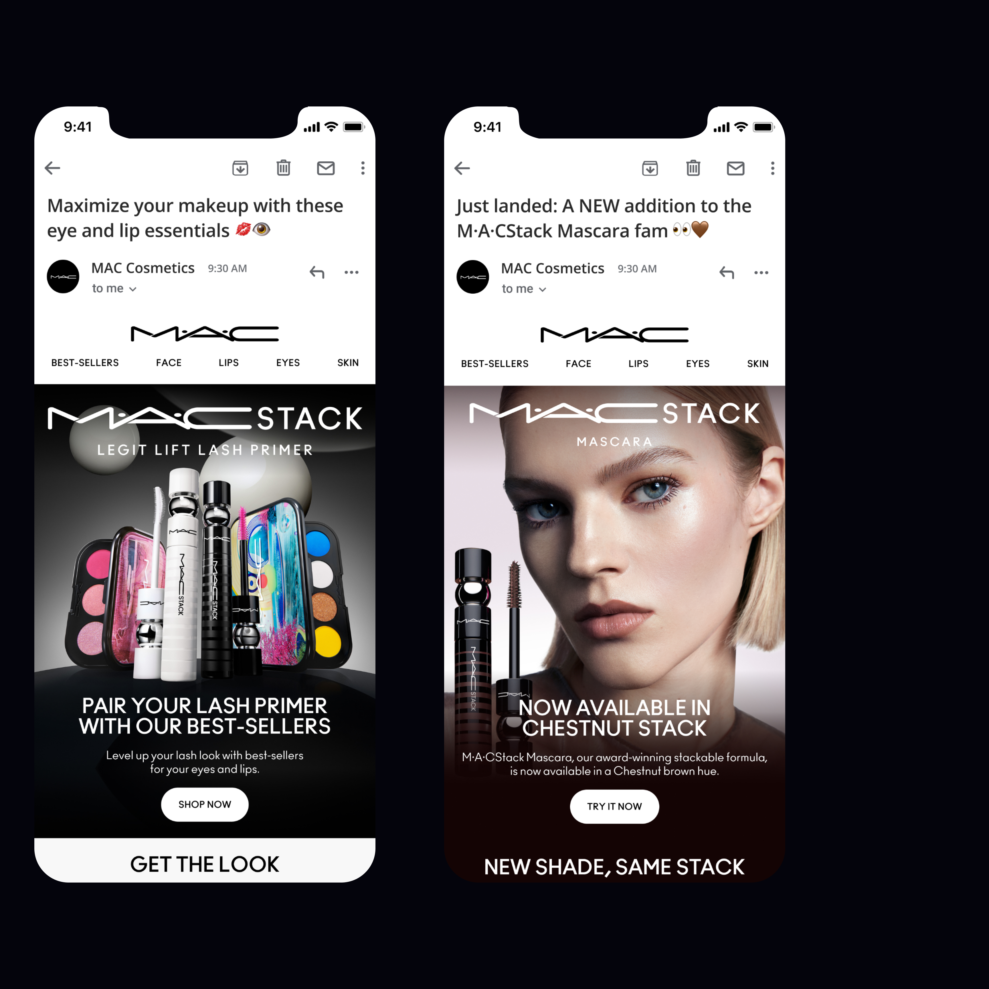
Leading the digital campaign, the focus was on creating a unified narrative across MAC’s core touchpoints. This included the development of dedicated brand landing pages, enhancements to existing product detail pages, and a full homepage takeover designed to highlight the launch with bold, high-impact visuals. Supporting assets across paid social, display, and email extended the campaign beyond the website, ensuring consistent storytelling and reach across the broader digital landscape.
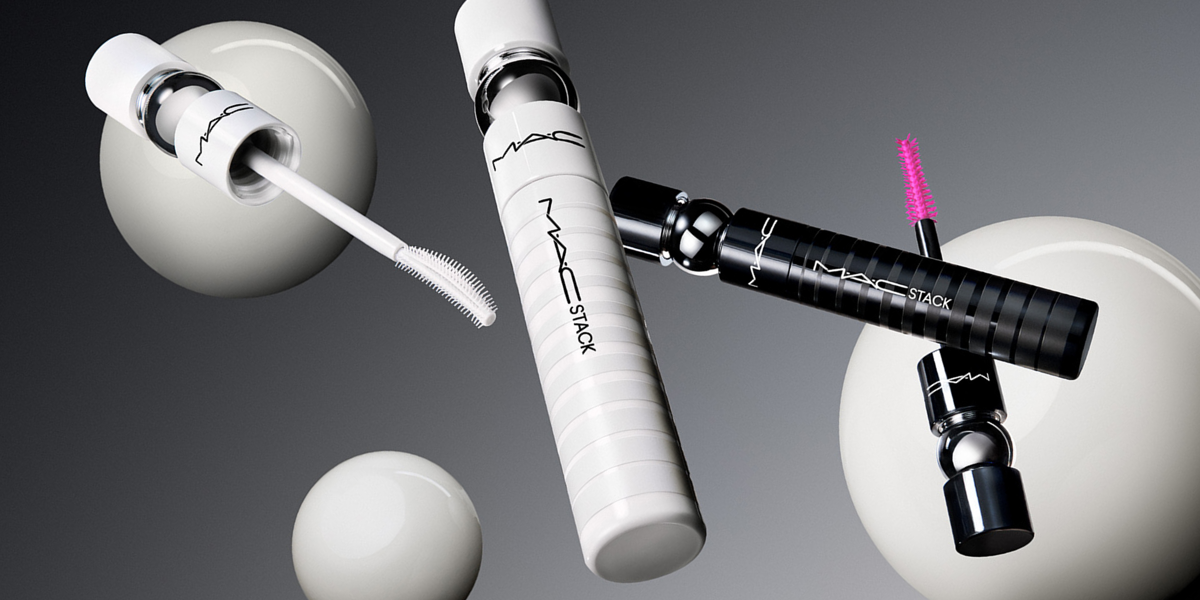
The creative direction emphasized clarity, texture, and product performance—showcasing the primer’s role in elevating mascara while spotlighting the iconic Chestnut shade within MAC’s broader narrative. By aligning campaign design, messaging, and digital architecture, the launch created a cohesive experience that amplified product visibility and drove engagement across channels.
MACSTACK
PRIMER
2024
SERVICES
PDP & Homepage Takeover for Brand dotcom
Site Assets for Brand dotcom
Paid Social & Display
Email Campaigns
TEAM
Sylvia Austin, Candice Park


DIGITAL EXPERIENCE
The digital experience for the MACStack launch translated MAC’s bold, artistry-led identity into a cohesive online campaign. While the logo and visual identity for the NPL were developed by MAC’s internal image team, the digital system extended that foundation across the brand’s owned channels. The experience emphasized product-forward storytelling—highlighting texture, performance, and shade—while maintaining consistency across supporting touchpoints such as email, paid social, and display. The result was a unified digital environment that amplified the launch and guided consumers through a seamless discovery-to-purchase journey.


THE VISUAL WORLD
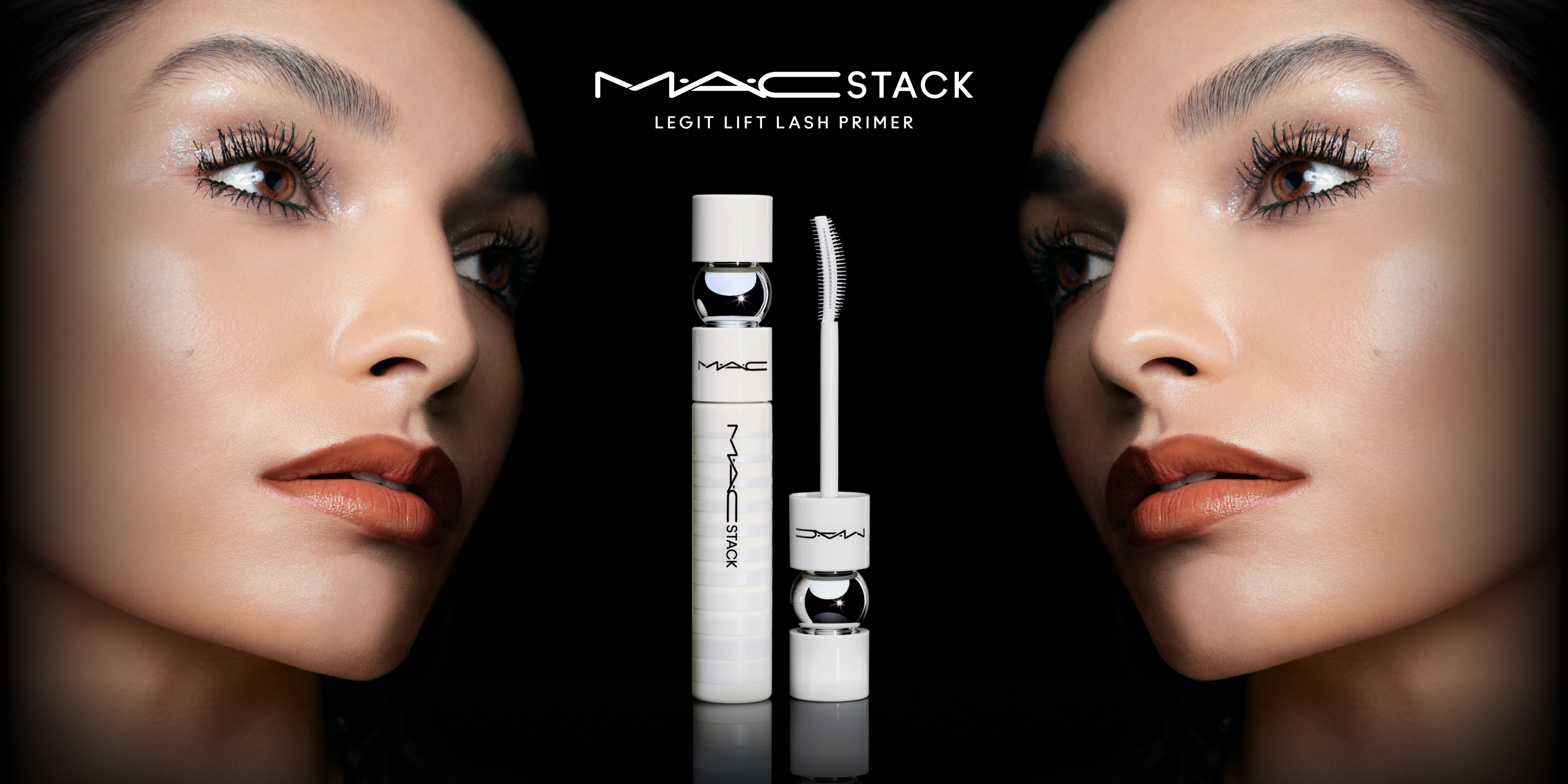
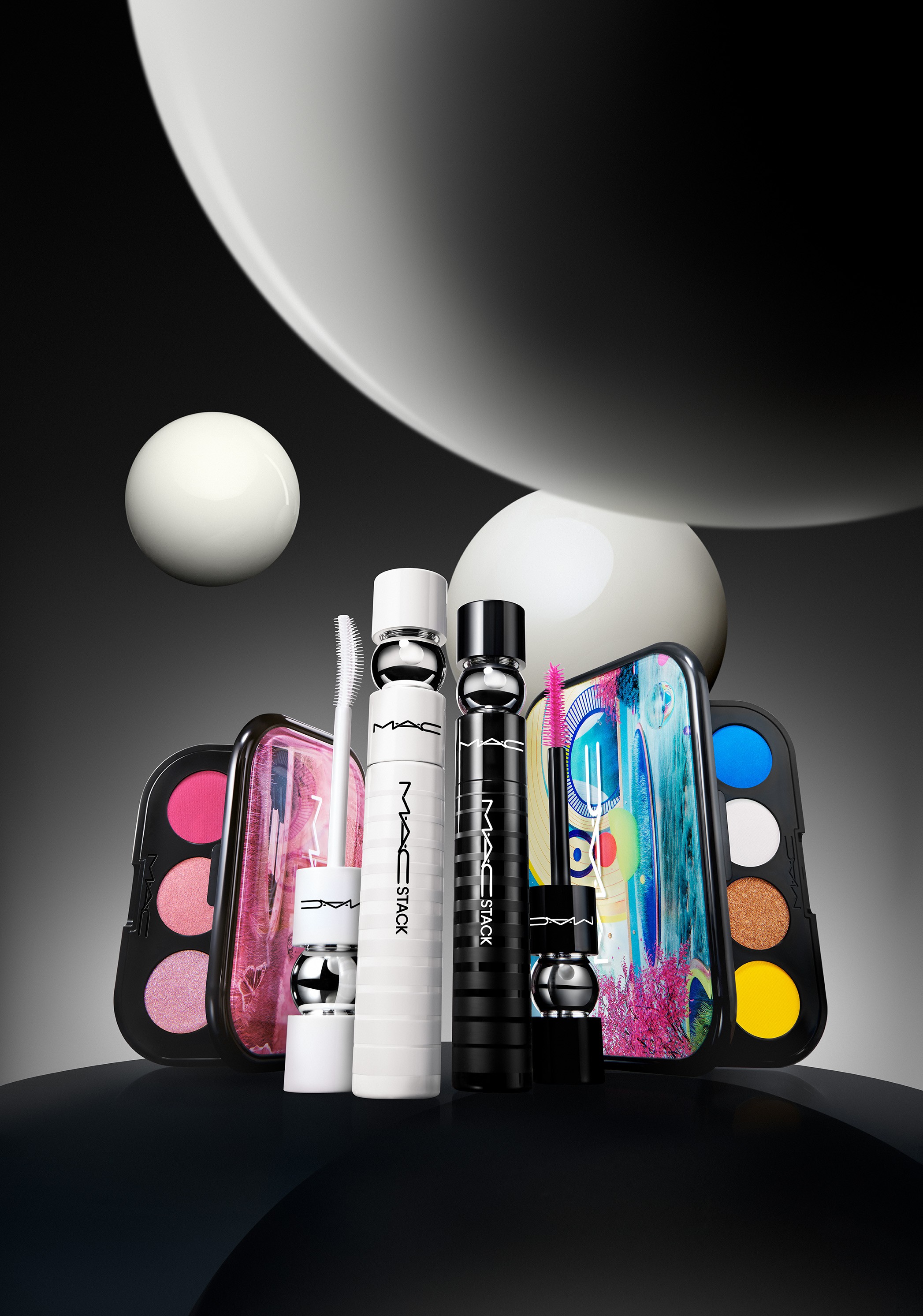
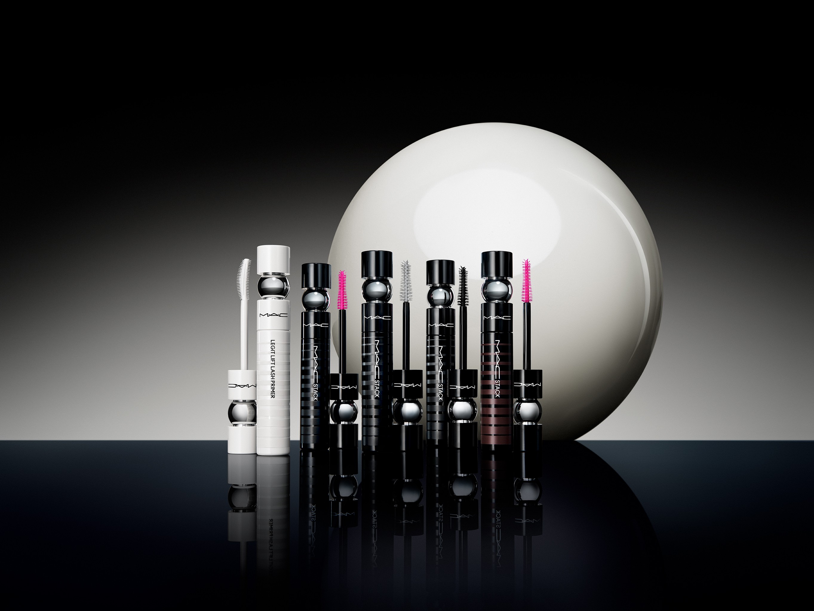
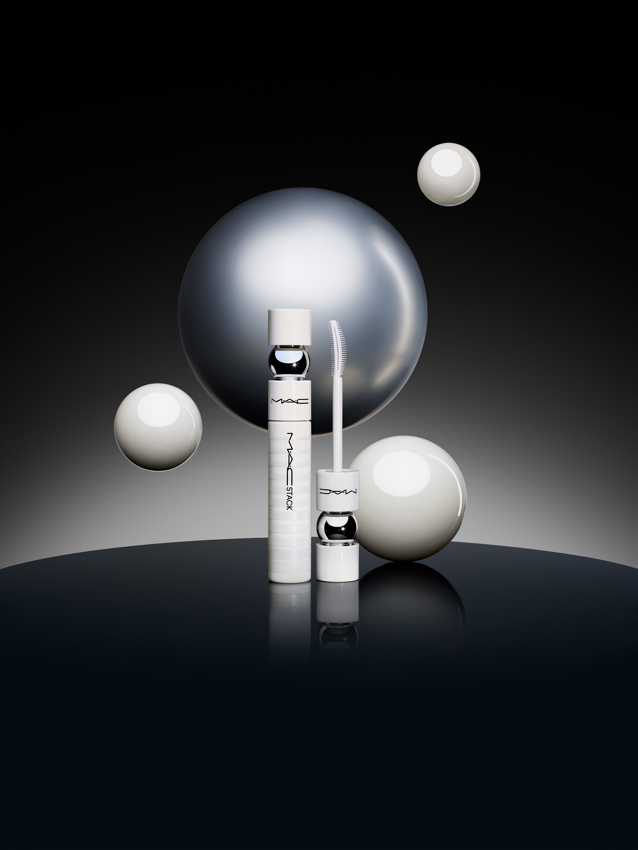
The visual world centers on contrast, clarity, and product heroism. Set against deep, dark backdrops, the photography creates a dramatic stage that allows the bright white primer to stand out with precision and purity, while warmer tonal lighting is introduced to highlight the richness of the Chestnut shade. The imagery is intentionally clean and focused, positioning the mascaras as bold, sculptural objects with a sense of presence and impact. Talent is incorporated to demonstrate the product in use—bringing movement, scale, and relatability—while reinforcing the beauty payoff and wearability. Together, the balance of heroic product moments and expressive talent imagery creates a visual language that feels confident, modern, and unmistakably MAC.
OFFICE HOURS
MONDAY–FRIDAY, 10AM–6PM
BROOKLYN, NEW YORK
(EST) / GMT-5
MAC Cosmetics introduced MACStack Primer alongside an their new color, Chestnut, offering as part of a digital-first product launch designed to capture attention across owned channels and reinforce MAC’s position as a leader in artistry-driven beauty. The campaign required a cohesive digital ecosystem that could translate product innovation into an immersive and visually compelling consumer experience.
Leading the digital campaign, the focus was on creating a unified narrative across MAC’s core touchpoints. This included the development of dedicated brand landing pages, enhancements to existing product detail pages, and a full homepage takeover designed to highlight the launch with bold, high-impact visuals. Supporting assets across paid social, display, and email extended the campaign beyond the website, ensuring consistent storytelling and reach across the broader digital landscape.
The creative direction emphasized clarity, texture, and product performance—showcasing the primer’s role in elevating mascara while spotlighting the iconic Chestnut shade within MAC’s broader narrative. By aligning campaign design, messaging, and digital architecture, the launch created a cohesive experience that amplified product visibility and drove engagement across channels.
MACSTACK
PRIMER
2024
SERVICES
PDP & Homepage Takeover for Brand dotcom
Site Assets for Brand dotcom
Paid Social & Display
Email Campaigns
TEAM
Sylvia Austin, Candice Park


DIGITAL EXPERIENCE
The digital experience for the MACStack launch translated MAC’s bold, artistry-led identity into a cohesive online campaign. While the logo and visual identity for the NPL were developed by MAC’s internal image team, the digital system extended that foundation across the brand’s owned channels. The experience emphasized product-forward storytelling—highlighting texture, performance, and shade—while maintaining consistency across supporting touchpoints such as email, paid social, and display. The result was a unified digital environment that amplified the launch and guided consumers through a seamless discovery-to-purchase journey.
THE VISUAL WORLD
The visual world centers on contrast, clarity, and product heroism. Set against deep, dark backdrops, the photography creates a dramatic stage that allows the bright white primer to stand out with precision and purity, while warmer tonal lighting is introduced to highlight the richness of the Chestnut shade. The imagery is intentionally clean and focused, positioning the mascaras as bold, sculptural objects with a sense of presence and impact. Talent is incorporated to demonstrate the product in use—bringing movement, scale, and relatability—while reinforcing the beauty payoff and wearability. Together, the balance of heroic product moments and expressive talent imagery creates a visual language that feels confident, modern, and unmistakably MAC.
OFFICE HOURS
MONDAY–FRIDAY, 10AM–6PM
BROOKLYN, NEW YORK
(EST) / GMT-5